Icon ideas for our Kickstarter, Betwixt!
January 19, 2012
Today I was working a bunch on creating an Icon for our Kickstarter Project, Betwixt. We’re starting to get to that point where a finalized Icon is a necessity so we can start sending out all the goodies we promised people who backed our project. I’m in charge of creating the image.
We’ve chatted with some of our backers about what kind of image they’re looking for, but I honestly have to say that some days I feel a little at a loss for icon imagery ideas. It’s difficult to know what people will always recognize, so I’m creating as many ideas as I can. For those who are interested/pay attention to my blog, let me know what you think.
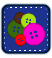
A quick reminder: our Kickstarter project is a text editor that is accessible via the web. Basically, this is an icon that will exist on your browser bar in Chrome (for many), so it needs to be easily distinguishable in smaller form. The colors are also arbitrary at this point. I’m using the same scheme for simplicity sake. If you have suggestions on color combinations please also let us know.
We’ve chatted with some of our backers about what kind of image they’re looking for, but I honestly have to say that some days I feel a little at a loss for icon imagery ideas. It’s difficult to know what people will always recognize, so I’m creating as many ideas as I can. For those who are interested/pay attention to my blog, let me know what you think.
A quick reminder: our Kickstarter project is a text editor that is accessible via the web. Basically, this is an icon that will exist on your browser bar in Chrome (for many), so it needs to be easily distinguishable in smaller form. The colors are also arbitrary at this point. I’m using the same scheme for simplicity sake. If you have suggestions on color combinations please also let us know.

 2012 FlamingLunchbox unless otherwise noted.